
I worked on this project as one of two product designers. I turned initial concepts and user research into solutions and app features. Throughout the process, I made sketches, wireframes, and interactive prototypes for the Patient First team to present and demo to stakeholders.
Figma, Photoshop
Jul - Aug 2020
Patient First
Approximately 87% of medical data is recorded manually in Pakistan. This results in loss of medical history, many unfilled prescriptions, and irregular monitoring of chronic diseases. The lack of organized and well-kept data makes it difficult for physicians to provide their patients with accurate diagnoses and necessary healthcare. Our challenge was to design and prototype a mobile healthcare app for Pakistani physicians and patients in order to digitize medical data.
The Patient First app is a digital medical record tool that assists the physician before, during, and after a patient visit. The app allows the physician to quickly access a patient's medical history, fill out visit details, and help book their patient's next visit.
Note: While there is a separate interface for patients, for the purposes of this case study, I will mainly focus on the physician interface design process.
In order to meet our client’s first prototype deadline within two weeks, we condensed our user research process to just two days. To better understand our target user segment in a short period of time, our client gave us interview transcripts with Pakistani physicians that they gathered over the last year. The transcripts gave us detailed insight into their work flow, user needs, and paint points.
Pakistani physicians are accustomed to keeping handwritten patient files, which can pile up and become disorganized. This sometimes leads to loss of information when files get misplaced. Additionally, physicians find it difficult to help patients manage chronic illnesses because oftentimes, patients lose or forget to fill out their prescriptions.
While diving deeper into our user research, we made note of the following takeaways that helped shape our designing mindset later throughout the process:
Physicians are extremely busy and need to work quickly
Physicians need a more efficient method to organize patient data and provide accurate diagnoses
Physicians need to help patients manage their chronic illnesses by monitoring their health trends and medications
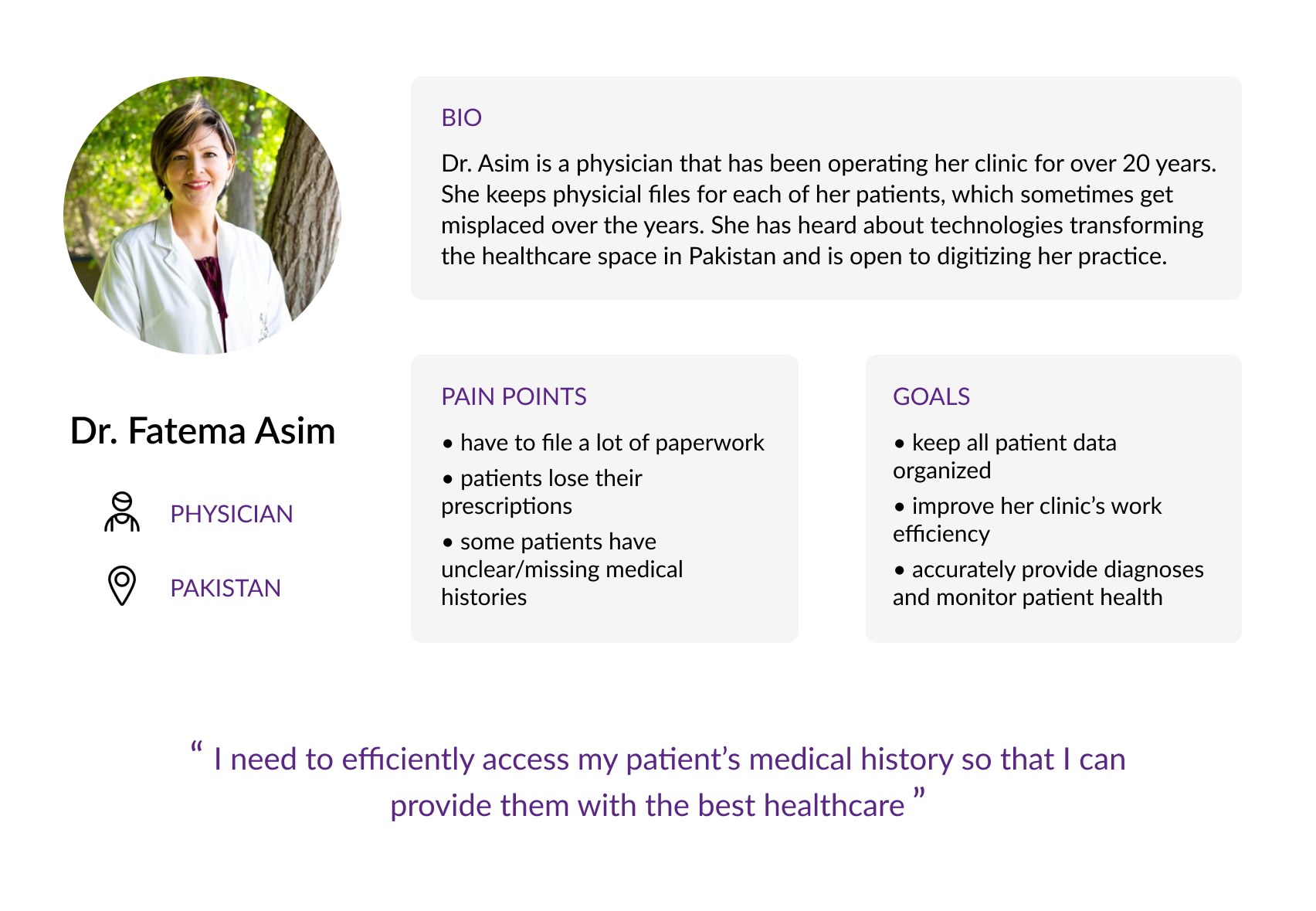
Dr. Fatema Asim is the user persona we created to represent our physician user segment. As a specialist in her field for over 20 years, Dr. Asim recognizes inefficiencies in the way her clinic operates.
Every now and then, she comes across new patients with missing or incomplete medical histories. This makes her job more difficult as she tries to help her patients monitor their own health. Additionally, with all of the paperwork she needs to fill out after each patient visit, some files inevitably get mixed up.
Dr. Asim is looking for a more effective way to organize her patients’ medical files and to make sure her patients are picking up their prescriptions. As she is busy, she needs a method that can be conveniently integrated into her workflow and easy enough for her to adjust to.
Taking a step further, we developed the following physician user stories in order to narrow down our focus:
Creating this user persona helped us empathize with our target user's pains and needs. During our ideation phase, I constantly referred back to our user persona and stories to make sure that we addressed these aspects.
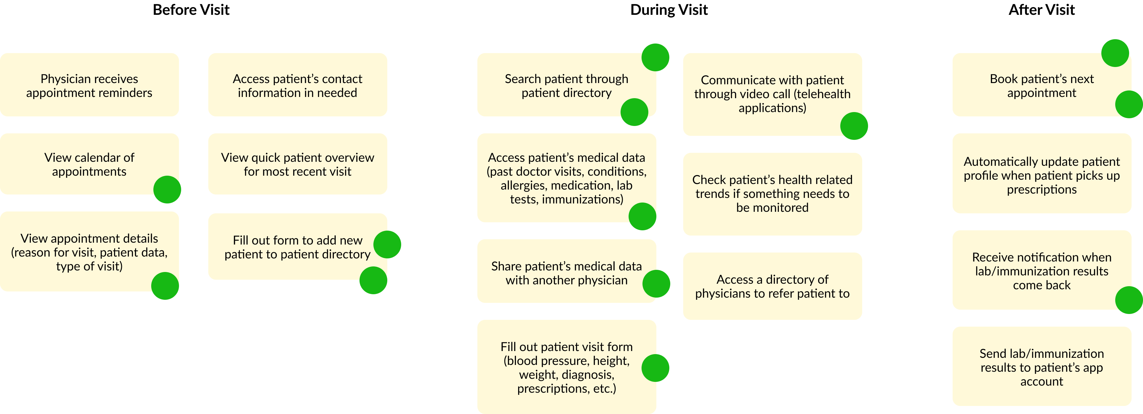
Initially, we developed a simple user flow chart to map out the general list of feature requirements our client gave us. Some of the features included a patient directory, adding new patients, patient profiles to access medical records, filling out appointment details, etc.
As we ideated, we organized these features into three different buckets: before, during, and after a patient visit. Here are some of the ideas that we brainstormed. The green dots represent our votes for key features that we wanted to prioritize in our first prototype iteration.
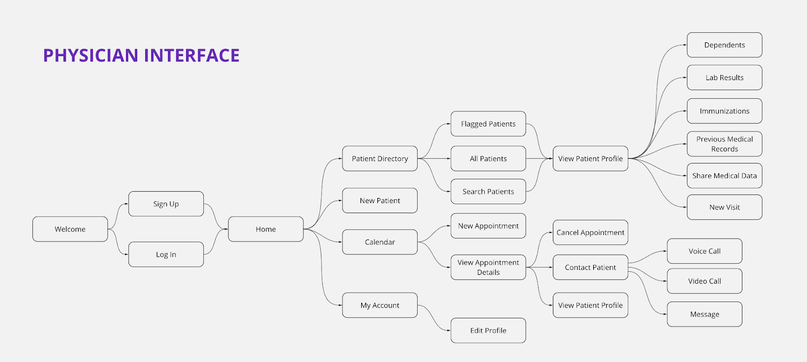
Since our app contains a large variety of features, we wanted to continue developing our user flow to help us keep our screens organized. Using the buckets we created, we added additional sections to the flow chart. Throughout our design journey, we continually edited it to reflect new user stories that were added along the way.
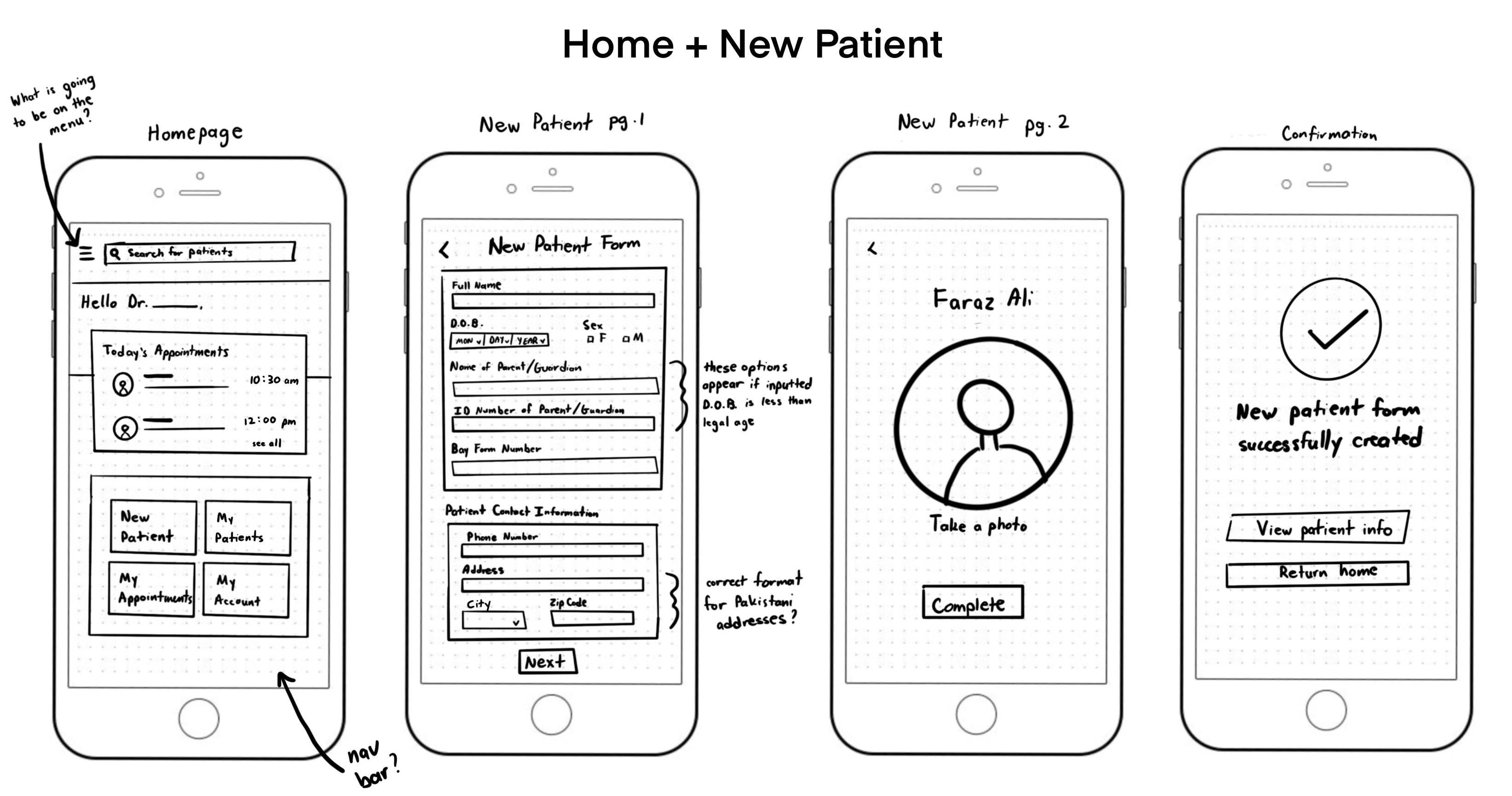
After our brainstorming session, we went over our ideas with the client to make sure we were on the same page. I made the following sketches for the app’s homepage, new patient, appointment calendar, patient directory, and patient profile screens.
The main goal of the sketches was to get client feedback on the preliminary layouts and flows before developing mid-fidelity wireframes. Our client appreciated the sketches as they helped visually communicate what I envisioned for specific screens.
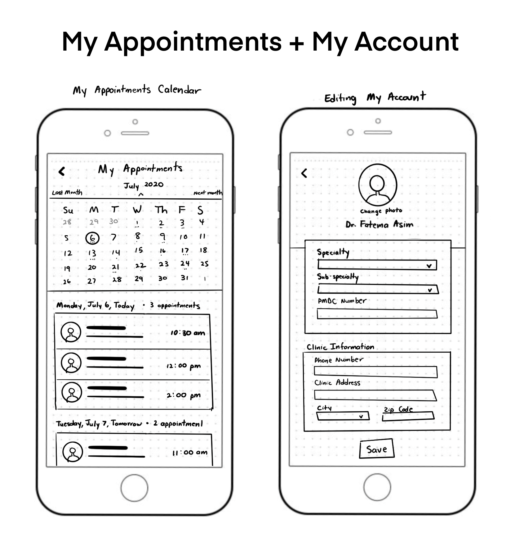
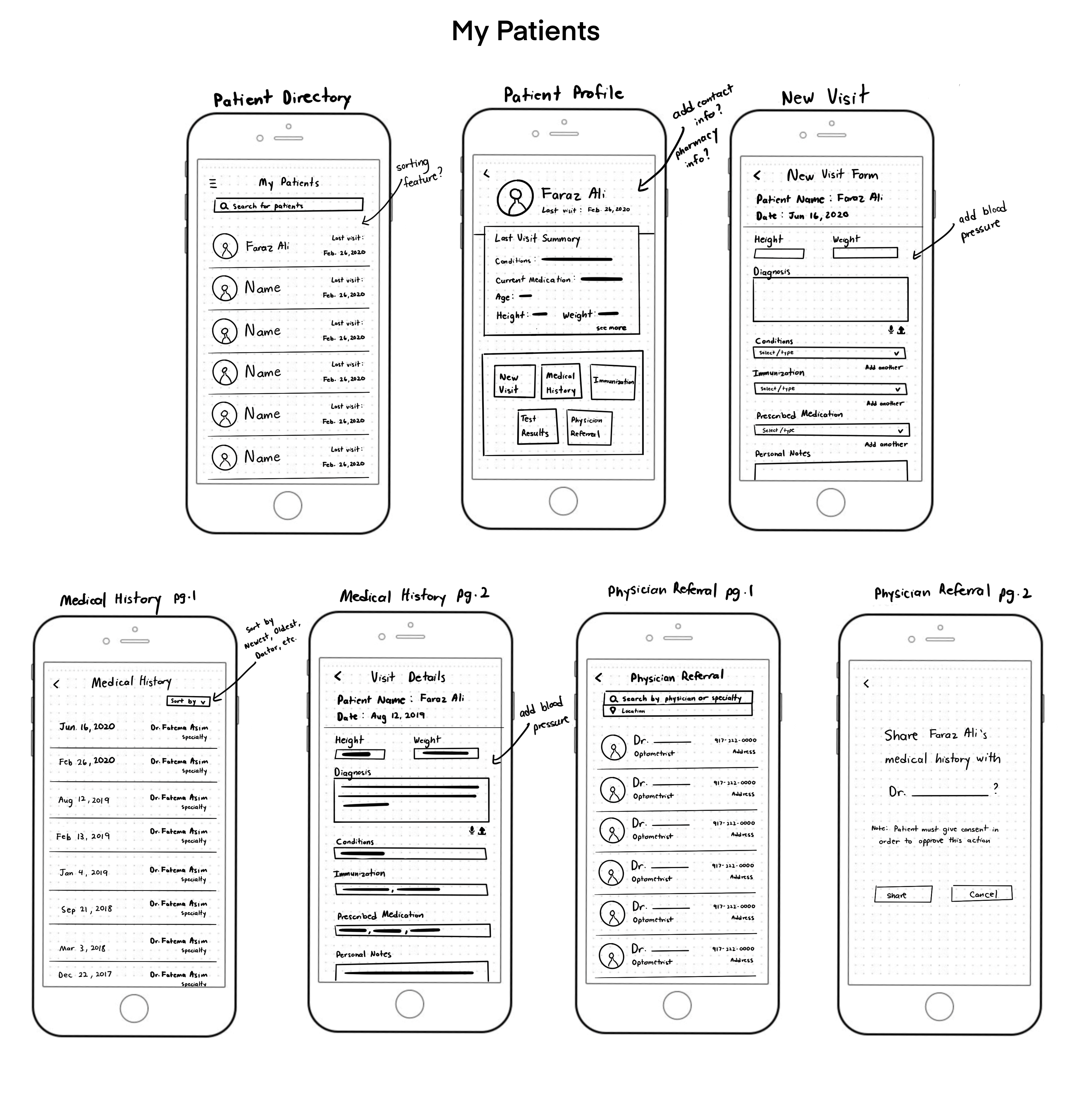
After presenting our sketches to the client, I incorporated their feedback into our mid-fidelity wireframes. While the sketches helped conceptualize our initial ideas, the wireframes helped clean up our formatting and got us started on thinking about how to visually design the screens. Our goal was to keep the interfaces simple and easy to navigate so that physicians could jump right into using the app. Since physicians value time and efficiency, we made sure to not introduce any complex or long procceses.
The following are examples of the iterations I made.
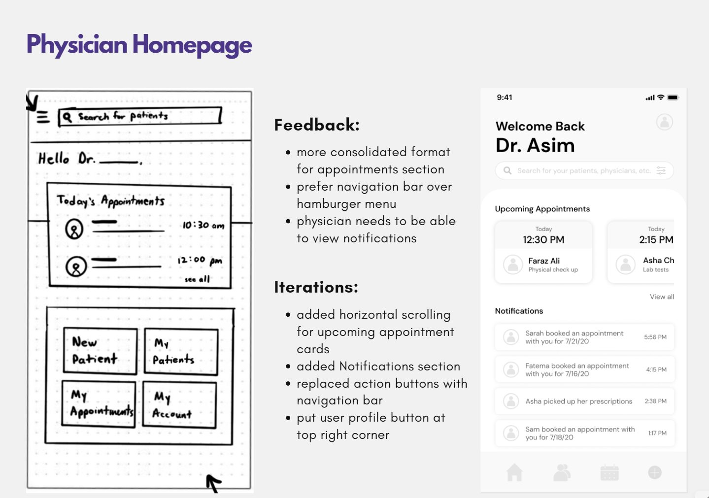
We spent approximately one week to accomplish initial research, sketches, and mid-fidelity wireframes. Since we were under time pressure to complete an interactive prototype before our client's key stakeholder meeting, we quickly shifted focus onto turning the mid-fidelity wireframes into an interactive high-fidelity prototype. Every few days, we would deliver sections of the prototype for review and user feedback.
Let's face it. Going from pen and paper to digital is going to take some getting used to. Even though Dr. Asim, our user persona, is open to exploring digital solutions, she needs a method that she can quickly pick up and can be easily integrated into her workflow. Even if our application has x and y features, it will be for moot if we are unable to get the physicians onboarded quickly enough to see the potential of our app.
While browsing UI/UX trends for ideas, I was inspired to create a simple tutorial to get physicians familiarized with the app's core features.
After the physician creates an account, they can go through a tutorial that shows them how to navigate the homepage.
Similarly, when the user navigates to other screens for the first time, a tutorial screen will pop up to guide them. These tutorials will help physicians get familiar with the app's ins and outs so that they can get to work faster.
Our client demonstrated the tutorial to two Pakistani physicians. They thought that it was a useful feature because it quickly introduced the app's key functions and how to access them. If we were not under a time constraint, we would have ideally conducted usability testing with the physicians to observe their behavior with and without the tutorial and to validate if the tutorial really does help them get started faster.
A few months after the end of my project, I revisted my mockups to redesign the app's UI. I wanted to give the app a more modern look while maintaining its simplicity and ease of use.
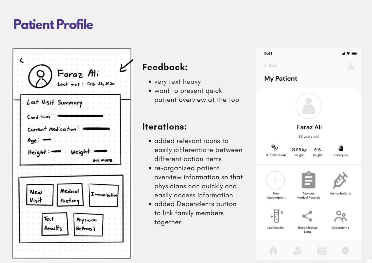
Throughout the design process, I was able to create and refine solutions to the pain points we identified during the ideation phase, using our user stories as a guideline. The following is a glimpse into the designs I created and how they solve our user issues.
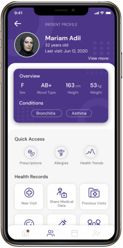
Quickly navigate through a patient's health history to find info such as prescriptions, health trends, previous visit details, immunizations, etc.
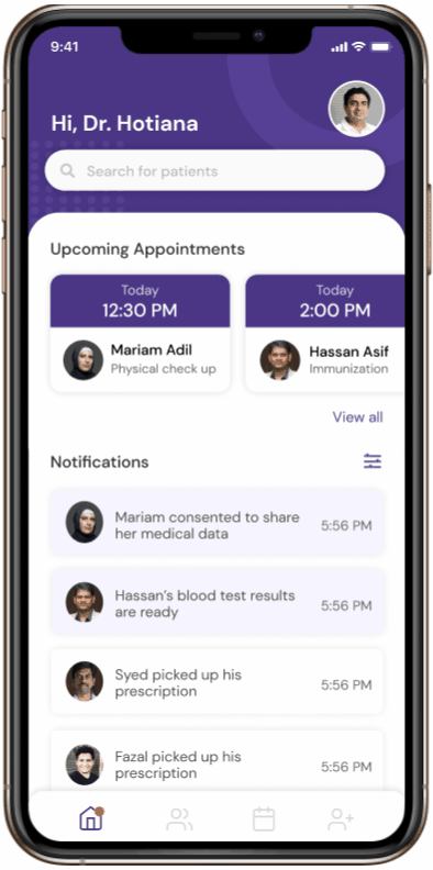
Efficiently carry out patient visits by viewing appointment details beforehand, holding telehealth sessions, and filling out visit details.
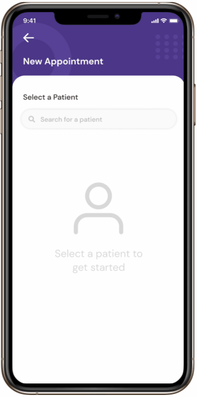
Easily schedule appointments to follow up with patients on their health. View your calendar to see upcoming appointments.