This page is currently under renovation

College-centric event management app that allows students to browse, share, and RSVP to events going on or around their campuses.
As the team's UI/UX designer, I conceptualized feautures to build by conducting user research and making sketches to help facilitate development.
InVision, Photoshop, Illustrator
2019
Currently, there is no single platform for students to view events happening on or around their campus. They have to rely on flyers, word-of-mouth, or Facebook posts to stay in the loop, which can be inefficient. This generates many missed opportunities for students to partake in activities that they would have enjoyed. Event organizers also suffer from the lack of event attendance due to low awareness.
CampusEvents is a native mobile application that allows students to browse through a catalogs of university-centric events happening on or around campus. The application also encourages students to attend events by providing personalized recommendations, sending reminder notifications, and allowing users to follow their favorite organizations.
To get a better understanding of the application's scope and assess potential risks, we created an assumptions map. We determined user assumptions, related validation tests, and risk levels. This assumptions map later helped us format our interview questions and provided a foundation for our prototype evaluation period.
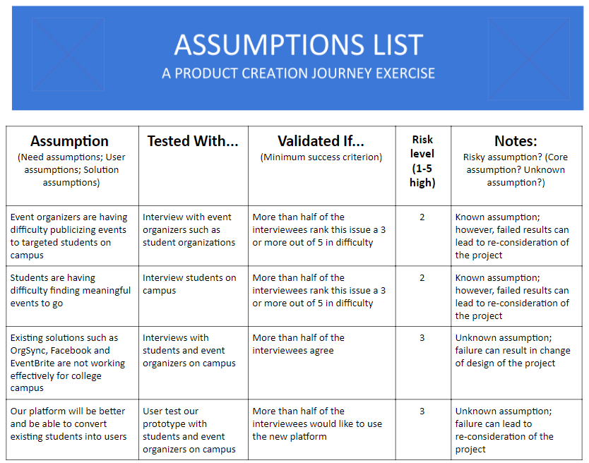
(click image to enlarge)
We interviewed nine people, four of which were evaluated as event organizers and the other five evaluated as event goers. Two of the event organizers are fulltime employees at the Boston University Arts Initiative, while the rest of the interviewees are undergraduate students.
After synthesizing our initial research, we created two user persona maps to help us empathize with our target users during the ideation phase. Freshman Fred represents the event goer audience, while Club President Patricia represents the event organizer audience.
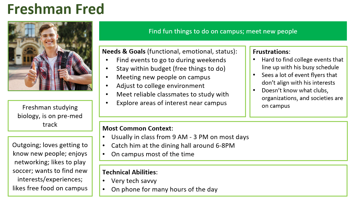
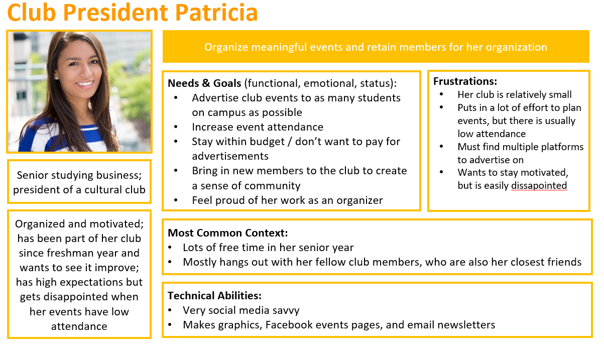
(click image to enlarge)
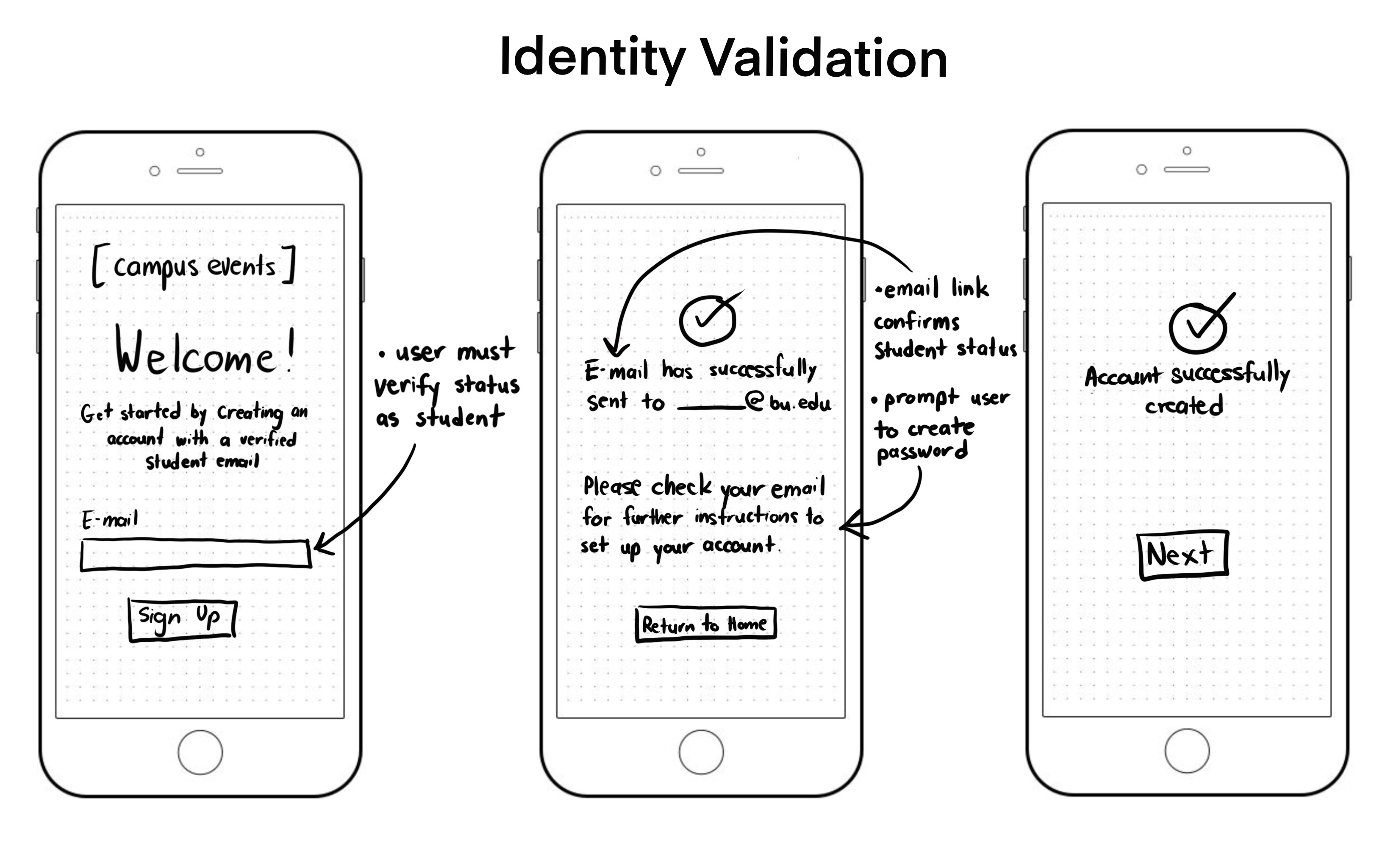
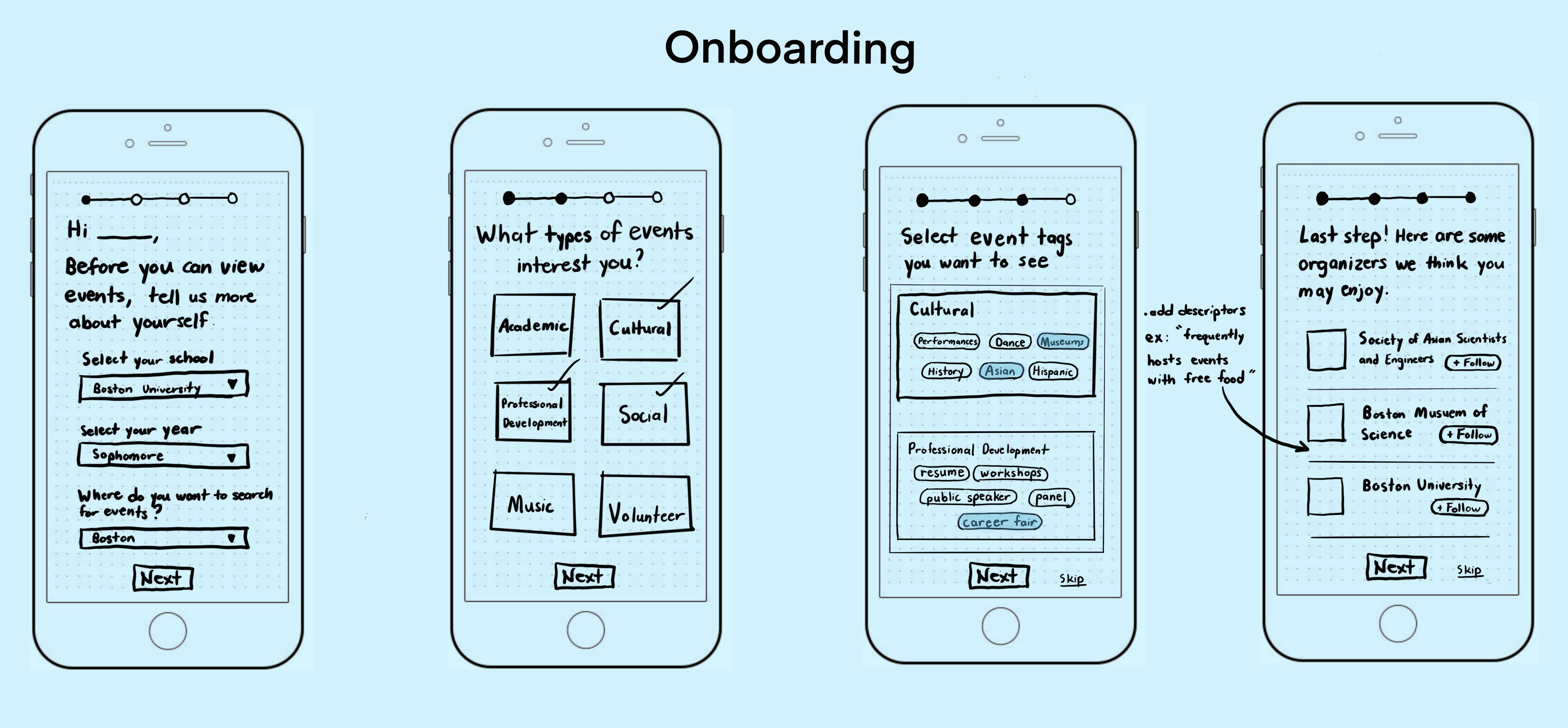
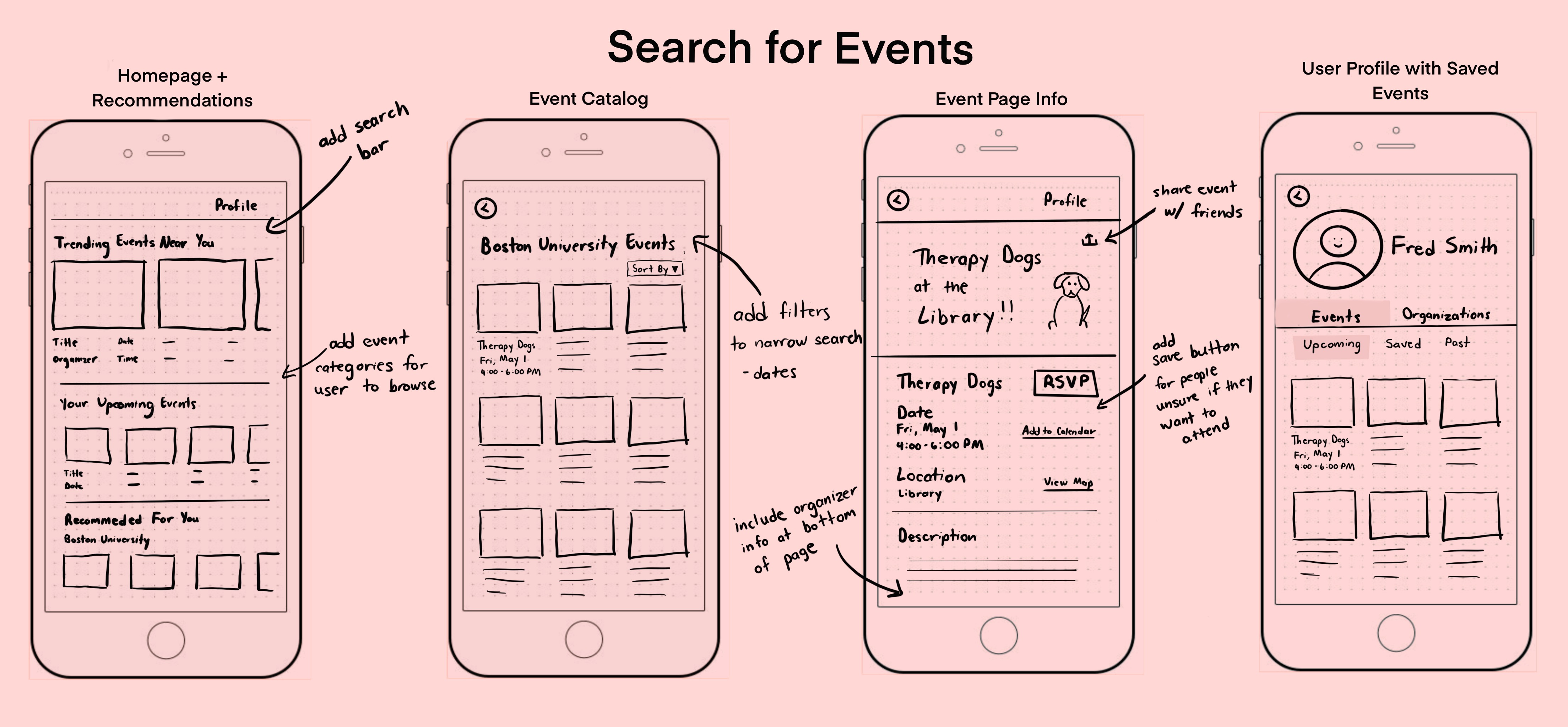
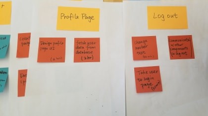
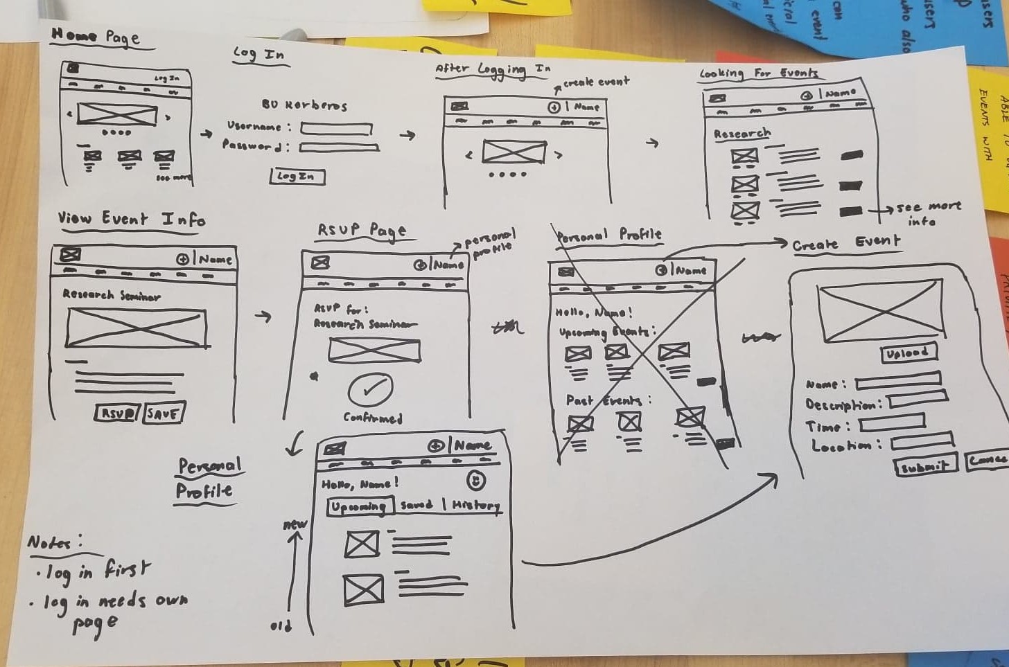
As a team, we held a two-day long design sprint to think of functionalities and features to include in our application. We did several brainstorming exercises including Crazy Eights, creating "How might we" questions, and affinity mapping. We concluded our design sprint by sketching wireframes based off our favorite ideas.
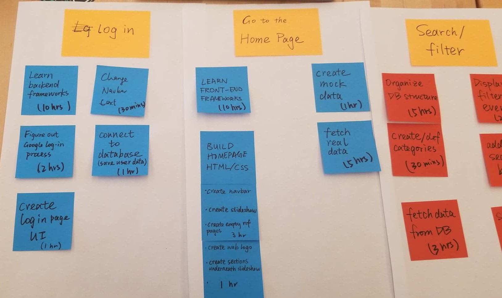
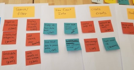
Some of the questions we considered:
Our solutions:
After our design sprint, we decided to prioritize on designing the app for the event-goer instead of both the event-goer and the event organizer. We chose to focus on three major aspects, which are identity validation, user onboarding, and the event searching process.
